TL;DR
This post note is part of a series where I’ll showcase / demonstrate cool features that I once built, but which didn’t make it to production for whatever reason.
I want to unblock myself (from wanting to write too detailed and therefore not finishing my drafts) and finally pick up low-key writing.
So here’s the kickoff.
I prototyped an interactive feature using Svelte + Canvas + WebGL + Voronoi / Delaunay triangulation to render > 10K data points. It didn’t make it to production.
The Context
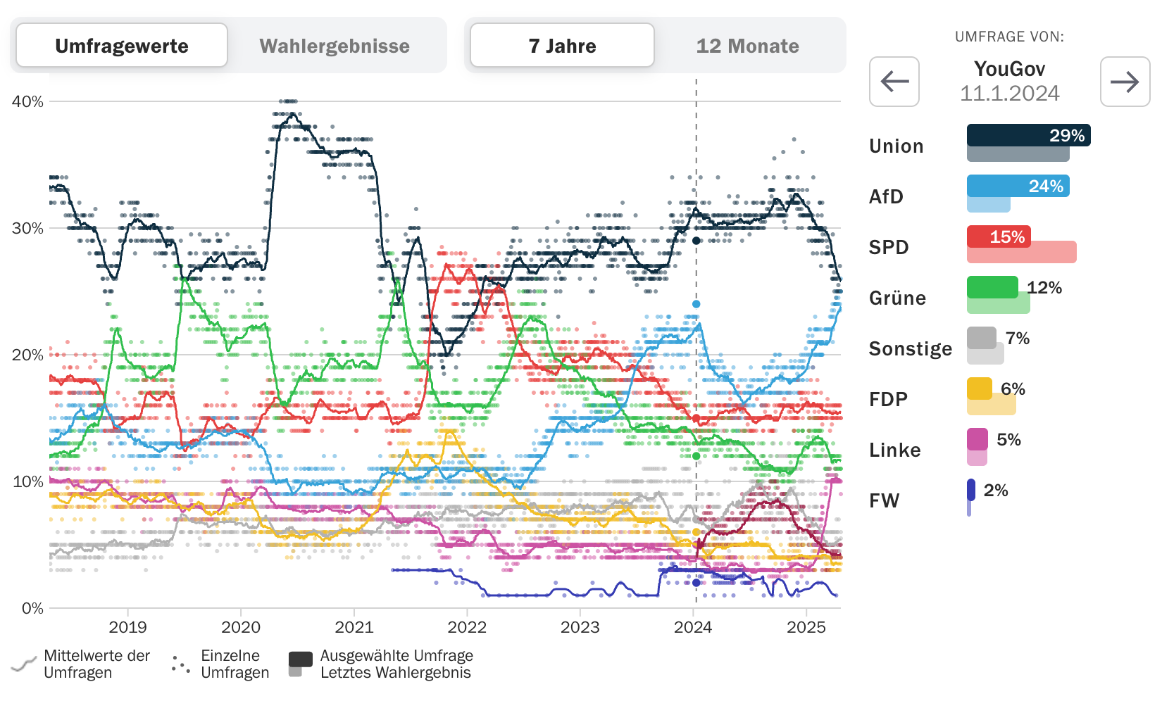
At a previous job I was tasked with fixing a broken yet important feature: a chart to visualize polling data over time. We had a bunch of upcoming elections to cover but both the feature and the data pipeline were partly broken (due to data structure changes etc.), and the legacy implementation was in vanilla JavaScript.
So I decided to do a rewrite using Svelte.
The basic concept was rather straightforward:
- core feature is a scatter plot of all data points for a set of parties over time (up to 7 years)
- for each party there’s an interpolated trend line to better represent the overall direction
- when hovering over a datapoint, a secondary chart - a dodged horizontal bar chart - shows the selected poll and compares it to the most recent election result for each party
Constraints:
- go live as soon as possible - local state-level elections first
- no SSR (yet)
- prerendering might be a future option but the legacy data pipeline wasn’t robust enough and the source data structure was too flaky
- at least 8 parties, each with a base and a light color
The (Technical) Problem
We prioritized the local state-level- and EU-elections so it was only later that I ran into a performance problem: Initially I chose a low-hanging / basic SVG + HTML approach with Svelte but polls for the Federal elections are happening at such a high frequency that there were just too many data points, causing lag when interacting on baseline devices.
It’s not a new or unsolvable problem:
“Lighthouse flags pages with DOM trees that:
- Warns when the body element has more than ~800 nodes.
- Errors when the body element has more than ~1,400 nodes.“
Well, I had to render almost 14.000 data points…
Daily / event-based prerendering (e.g. the dots as a static PNG layer) wasn’t an option at that moment, so I finally got the opportunity to use Canvas in Svelte.
The Feature
Challenges
- too many data points per pixel
- how to render performantly?
- how to identify which point is selected in < O(n) (ideally in O(1))?
- how to select the data in < O(n) (ideally in O(1))?
Approach
Based on my experience with Svelte, a robust approach to producing interactive charts and features is to rely on SVG only for rendering non-HTML-friendly shapes (like curved paths) and to keep most if not all of the markup to HTML + CSS. This means a bit more effort during setup stage but allows for much more flexibility and ergonomics when it comes to implementing responsiveness, interaction and dynamic elements.
In this case, using Canvas for rendering the dots seemed like the most obvious choice, so I ended up using a mix of Canvas, SVG and HTML.
Since dealing with changing colors and opacity in Canvas- (or rather shader-)land turned out be too tricky for me (with no shader experience before this project), I had yet to solve it.
Rendering
Ultimately, I used LayerCake to compose the different layers of the chart.
Here’s a plain Canvas (no WebGL) version, where I hadn’t figured out data-based coloring yet.
The Canvas + WebGL example led me to regl and it took me some time to understand how colors and resolution work in WebGL.
Interaction & Data Selection / Lookup
There might be better approaches, but I decided to keep the SVG layer for interaction (hovering, clicking) and the Canvas layer for rendering.
Instead of searching for the closest date (x-axis) based on plot coordinates (remember: too many data points per pixel), I remembered Delaunay triangulation from one of my favourite classes I ever took during my Master’s: Introduction to Geocomputation / GIS.
Fortunately, it’s been long implemented in a d3 core library with great documentation.
In short, using Delaunay triangulation you can compute an unambiguous area around each data point. Each data point can be assigned an area - a Voronoi cell. Each cell contains only one data point. Give each cell an id, and you can use that id to look up the data point. That’s it.
Here’s an example (with years on the x-axis and values on the y-axis) - feel free to hide cells and also try keyboard navigation:
| selected: - Previously I used something very simple and brute like d3 scale.invert() to get the date and then a linear search data.find(d => d.date === selected_data). At this scope, this seemed like a bad approach.
There are also coordinates-based approaches for Canvas, which a) didn’t feel natural to me and b) would require me to store the data points in a different way. And I’m a big fan of lookups.
For Voronoi I needed to create a unique set of data points anyway, so I might as well index them (turning an array into a keyed object / Map) and use the object for the data lookup.
And then it’s just a O(1) operation to set the selected data point and a O(1) lookup to get the data point.
Done.
Well not exactly, because I still needed to highlight the dots for the selected date. One big perk of LayerCake is that all layers have access to a shared context. This context includes the data, the dimensions, and the scale functions (xScale and yScale in this case).
So instead of tinkering with shaders in WebGL-land I just used the SVG layer to draw circles for the selected data points (and only those), and that was it. I needed the SVG layer for linecharts (the trend lines) anyways.
Now we’re done.
Loading comments...